Genuine In-Person Networking For Professionals
FIVE-TO-EIGHT - A social networking app
Overview
Objective - Create a genuine and effective
in-person networking experience for professionals.
Purpose of the project - I integrated and practiced the UX design toolkit I learned through "Springboard Online UX course" while building every step of this product.
Mentor -
Miklos Philips, Principal Lead, Product Design and Strategy at
Toptal.
My role - Since this is a solo project, I performed all project roles, from research to develop of the Hi-Fi prototype.
Challenge - How to make networking more fun and less awkward. Make people really want to participate, and avoid falling into networking clichés.
Final product showcase - Hi-Fi prototype and animations for mobile app.
Why an in-person networking tool in a digital age?
It's hard to create meaningful and sustained professional relationships with people you meet through online networking sites like LinkedIn.
Many professionals understand that their networks are a key to business and personal success. And in the age of online social networking, apparent opportunities to connect with new people are everywhere. But developing professional connections purely through online tools like LinkedIn rarely result in meaningful and fruitful professional relationships. Although the latest available data (1/4/2017) shows that the total number of LinkedIn users is 467million, only 18 percent are visiting the professional social network daily.

Data source: pew research center
In-person networking is the key.
On the other hand, a Harvard Business Review global survey of 2,300 subscribers in 2009 reported that “95% said that face-to-face meetings are key to building successful long-term relationships. Furthermore, 89% agreed that face-to-face meetings are essential for ‘sealing the deal.’”1 (citation:The Value of Face-to-Face Meetings, The Center of Association Leadership)
Social discomfort does exist during live events.
Despite the greater effectiveness of face-to-face interactions in helping professionals build meaningful connections, many professionals find it difficult to take part in live events and activities. They cite many barriers: the need to plan in advance to attend events, the concern that events might not be attended by the types of people they want to meet, and the discomfort many experience speaking to new people.
Here comes the design challenge:
How can we help working professionals overcome these barriers and create a more genuine and effective in-person networking experience with the help of information technology?

Research and Findings
Interview Objectives: Through secondary research and interviews, I gained an initial understanding of the target user’s networking motivations, goals and barriers. Six professionals who are networking activities-goers participated the interview.

Interview Findings:
1. Four Major motivations and goals for networking

2. Four major barriers and sources of discomfort during networking


Survey respondents broadly reflected the demographics of target users. Near 90% percent of them are full time worker who are my target users. Furthermore, the respondents have almost same ratio for men and women, quite evenly spread out to different regions in the United States, who belongs to different age groups.
The important findings that will impact the future design includes:
1. Weekdays after work ( happy hour) are most preferable time slot of networking.
2. People prefer to go to networking event with someone else.
3. "Word-of –mouth" is how people find out about networking opportunities.
Therefore, it makes sense to target the time slot between 5pm-8pm as our primary service time and to design a mobile app or a website, with features that encourage word-of-mouth adoption.
Personas
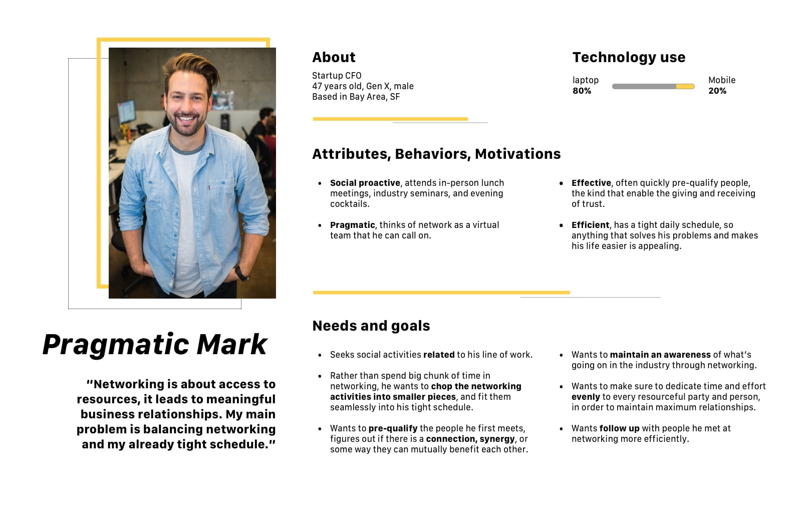
In order to illustrate the key audience of my product, and to help potential stakeholders gain more sympathy for the target issues, I decided to build personas. After combining the major findings from the interviews and the surveys with other research reports I gathered online, I listed the insights I had developed which could impact the future design, sorted them on the whiteboard, and built two personas: Techy Sarah and Pragmatic Mark.
.jpg)


UX competitive analysis
There is one mobile application who has relevant approaches: Shapr. It also targets at young professionals’ networking needs and provides the users quality in-person meetup experiences. The current industry leaders in professional networking: “Eventbrite”, “LinkedIn” ,“Meetup” and “Eventbrite”. Although they are not our direct competitors, I seek to learn from their advantages and shortcomings.
Criteria of comparison: after studied the six competitors’ products, I categorize the design features into four main categories: “Efficiency of use”, “Time and location flexibility”, “User engagement” and “Safety”.

Based on the analysis above, the opportunity would be a product that focus on medium size of networking event, like 30-50, and focus on these four aspects' performances:
1. Good efficiency of use: the product can suggest related events to the users based on commonalities, save them time on browsing the hundreds of options. It should allow users to connect with each other.
2. Time and location flexibility: the product can use GPS/location technology to locate event, help the user to decide if it is convenient to join; it should also allow the user spontaneously attend a networking event, rather than too much of advanced planning.
3. User engagement: the product should be fun to use rather than make people feel obligated. Networking event can anxiety provoking, gamification element could help with this situation.
4. Safety: the products should allow users to control how much information publicly list.
From research findings to design solution
I use a chart to list all the research findings: the users’ needs and the markets demanding, and brainstorm the corresponding solutions. It allows me to organize research information in order to not slip any valuable findings. Afterwards I select the solutions which are more possible to be fit into a real life user scenario: looking for events- arriving at events - event onsite - after events.

User stories
In order to create a simplified description of a mobile app feature requirement, and to make sure all the features are from an end-user perspective, I create user story. See the
full version document of user story.
Sitemap of mobile app

Wireframes


.jpg)


.jpg)


